Brand identity
How to use the bikedo.app brand.
A short guide to the wordmark, palette, typography, and the way we talk about the product. If you're using BikeDo assets in a partner site, a press kit, or a community post, this is the source of truth.
Wordmark
Two color, two weight, one Clay accent. Inter Black, letter-spacing tightened.
On Black
On Light bg
Monochrome (last resort)
Small (favicon / app icon)
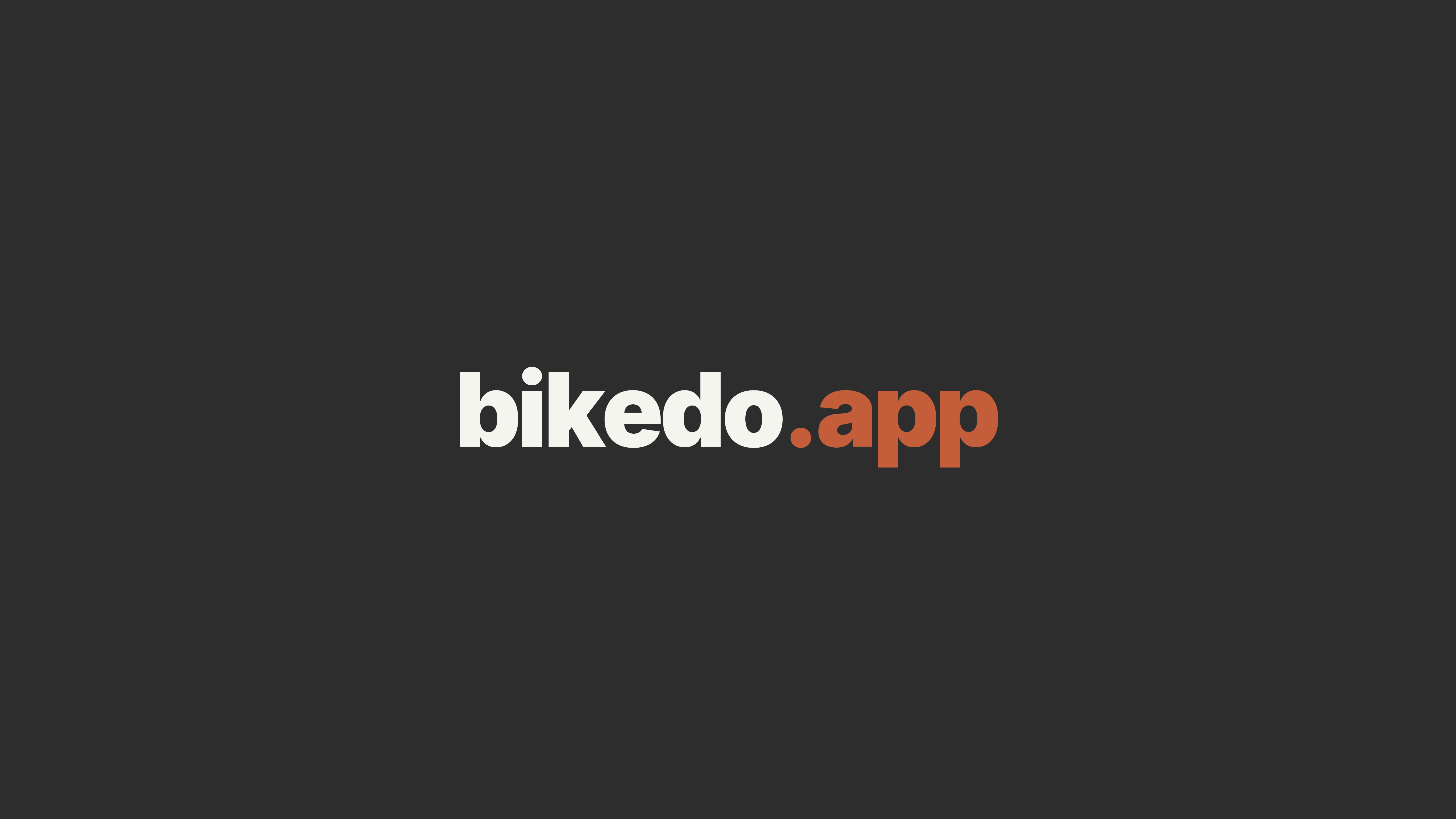
Wordmark is always “bikedo.app” (lowercase). The “.app” suffix is always Clay.
Clearspace around the wordmark is at least the height of the “b” glyph. Don't crowd it.
In prose, write the product as BikeDo (CamelCase) — never “BikeDo App” or “BikeDo API”.
Icons
The app mark — a lowercase “b” in Clay on a dark tile. The same mark works as the app icon, the favicon, and the icon in footers or signatures.
App icon
Rounded square, Clay “b” on a Black/Charcoal tile. iOS and Android, the App Store and Google Play.
Download · PNG 1024
Favicon / small
A larger letter for legibility at 16–32 px. Browser tabs, bookmarks and PWA.
Download · .icoDon’t recolor, distort or rotate the mark. Keep its proportions and clear space.
The icon has its dark background built in — don’t place it on another dark tile without spacing.
Wallpapers
Desktop wallpapers in the brand palette — the wordmark on charcoal, in 5K. Pick the plain mark or one with the slogan.

For phone

Wordmark only
Just the wordmark, mark in the lower half (lock-screen safe). iPhone and Android.

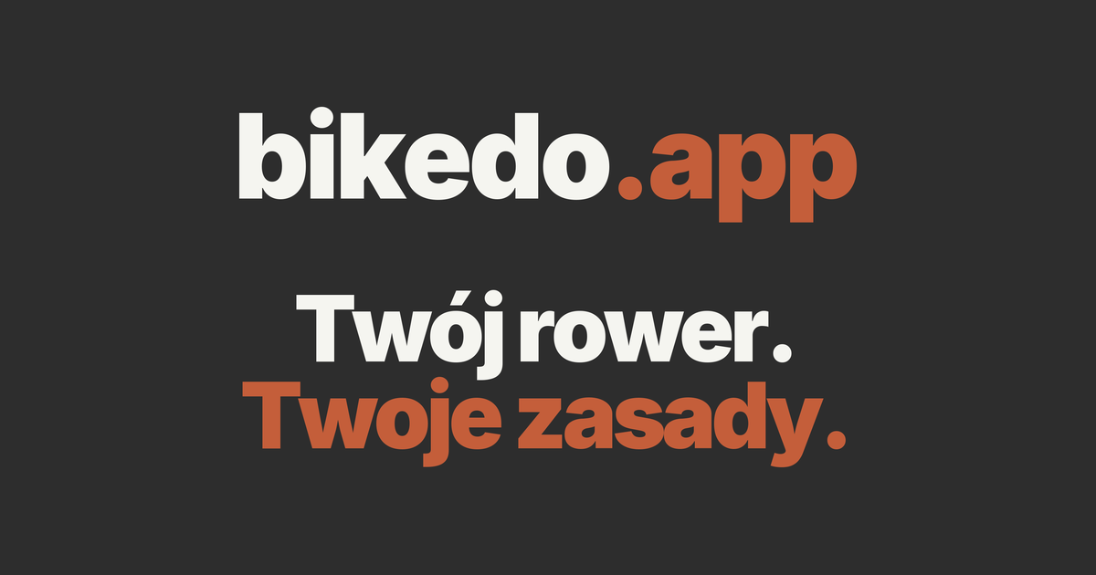
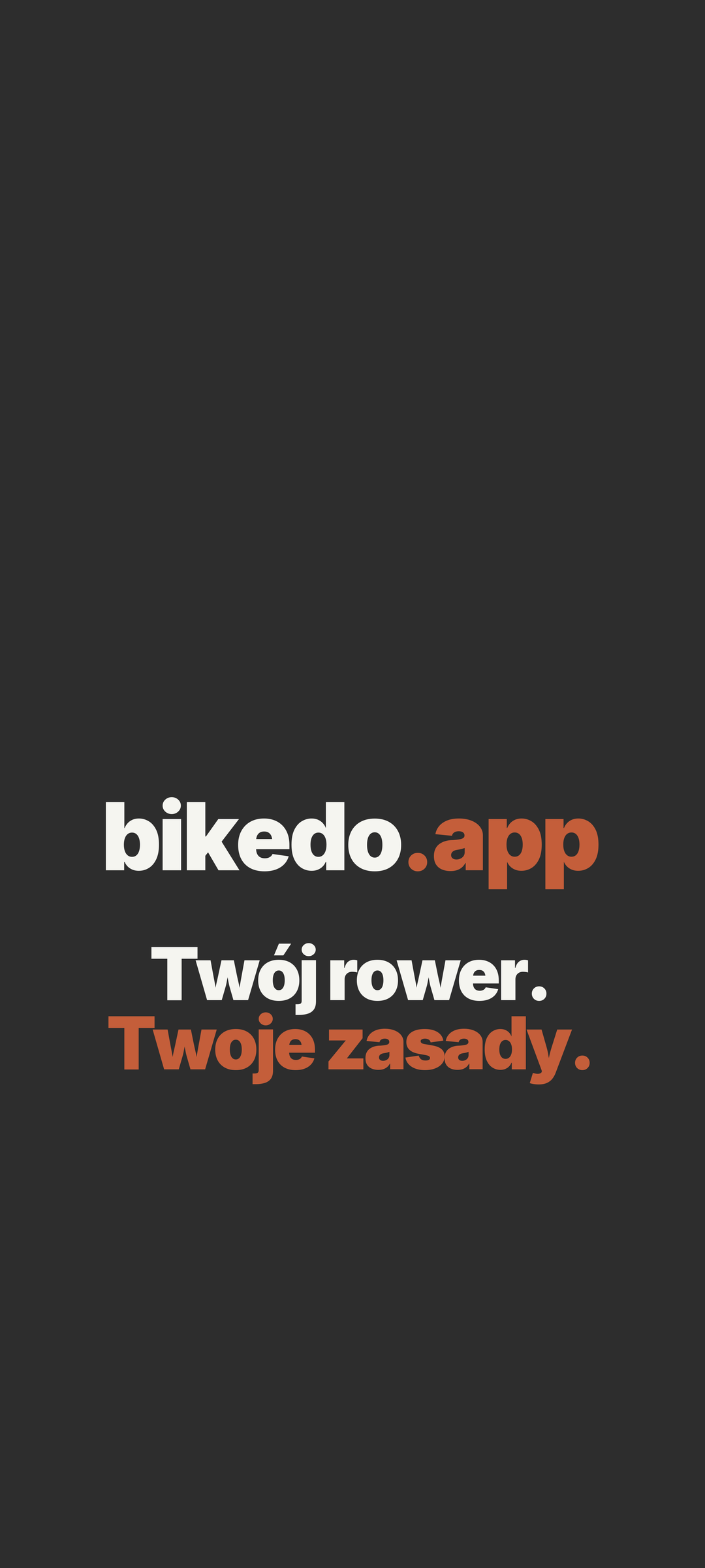
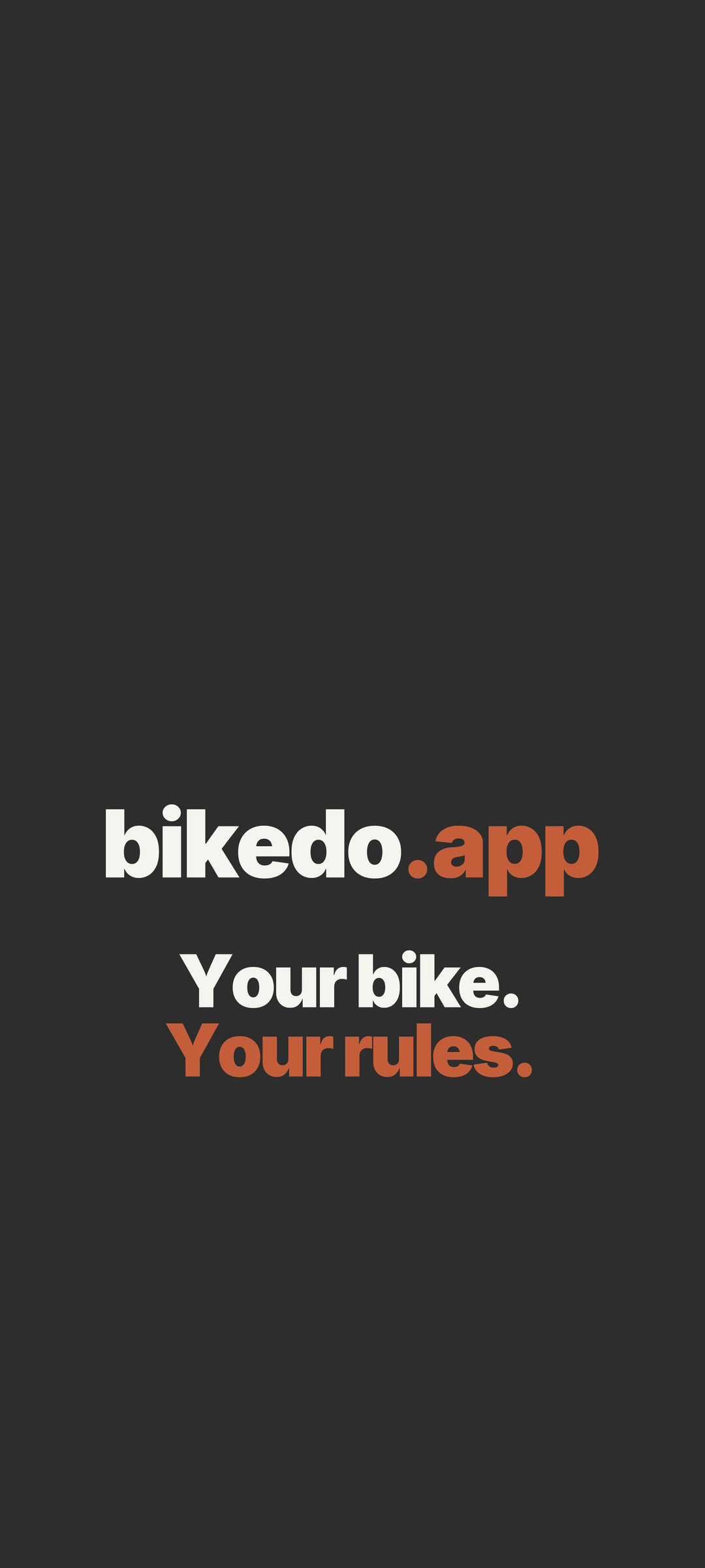
With the slogan · PL
The wordmark with the slogan, in the lower half. iPhone and Android.
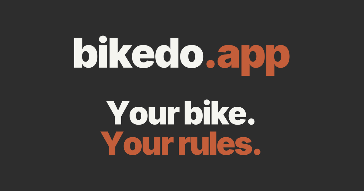
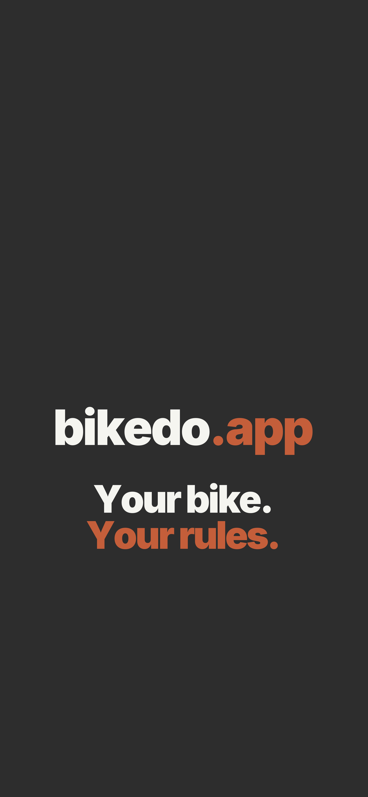
With the slogan · EN
The wordmark with the slogan, in the lower half. iPhone and Android.
Social / share

Color palette
Canyon-inspired. One warm accent (Clay), two darks, two neutrals, two text tones. Each color has a defined role — keep them in that lane.
Clay
#C45E3APrimary accent. CTAs, links, focus rings, active states. Never as page background.
Black
#1A1A1APage background (dark surfaces). Default canvas in the mobile app and the web product surfaces.
Charcoal
#2D2D2DCard / panel background on dark surfaces. One step lighter than Black.
Stone
#4A4A4ABorders, dividers, hairlines on dark surfaces. Reduce to 30–60% opacity for subtle separators.
Text light
#F5F5F5Primary text on dark surfaces. Headings and body copy on Black / Charcoal.
Light tone — pair with Charcoal or Black text.
Text muted
#78716CSecondary text, captions, helper text, placeholders. Meets WCAG AA on Black for body sizes.
Sand
#E8DED5Border on light surfaces (marketing pages, mockups). Pairs with Light bg.
Light tone — pair with Charcoal or Black text.
Light bg
#F8F6F3Off-white surface for the light theme and product mockups. Never pure white.
Light tone — pair with Charcoal or Black text.
Typography
Inter for the product and body. Playfair Display for editorial headings on marketing surfaces. Don't mix them — pick one role per surface.
UI + body
Inter
The quick brown fox jumps over the lazy dog
Editorial headings
Playfair Display
The quick brown fox jumps over the lazy dog
H1 — Playfair, 48–60px
A simpler home for your bikes.
H2 — Playfair, 28–36px
Track service history without spreadsheets.
Body — Inter, 16–18px
Log a service in two taps. Add a photo. Share with a shop. The whole history travels with the bike when it changes owners.
Caption — Inter, 12–13px
Last serviced 14 days ago · 1,240 km
Voice & tone
BikeDo sounds like a calm, competent friend who happens to know a lot about bikes. Confident, specific, never hypey. We don't shout.
Do
Use the wordmark as “bikedo.app” with .app in Clay.
Pair it with Inter Black/Bold and let it breathe — at least the height of the “b” glyph as clearspace.
Write the product in prose as “BikeDo” (CamelCase).
Body copy reads better mid-sentence with the CamelCase form than with the lowercase wordmark.
Use Clay sparingly — as the one accent on a Black/Charcoal page.
When everything is accented, nothing is. Clay should pull the eye to the next action.
Use sentence case for headings and buttons.
Sentence case feels more like a person talking, less like a corporate product.
Don't
Don't write “BikeDo App”, “BikeDo Mobile”, or “BikeDo API” in prose.
It's just BikeDo — the app and the API are implementation details, not part of the name.
Don't change the wordmark color split.
“bikedo” always in Text light (dark backgrounds) or Charcoal (light backgrounds); “.app” always in Clay.
Don't put Clay on Clay or recolor the “.app” suffix.
It loses the recognition cue that anchors the wordmark.
Don't use pure white as a background.
Use Light bg (#F8F6F3). Pure white feels clinical against the earthy palette.
Don't add a tagline lockup next to the wordmark.
If you need a tagline, set it on its own line below the wordmark in Text muted.